Building a scalable foundation for consistent, accessible, and efficient product experiences
Overview
As OneWelcome’s Identity and Access Management platform evolved, so did its complexity. New features were being added rapidly, multiple teams were contributing to the product, and the interface was expanding across different modules, workflows, and customer needs. On the surface, the product worked. But underneath, the experience was becoming fragmented.
Buttons behaved differently across screens. Form fields weren’t always consistent. Spacing, typography, and interaction patterns varied depending on who designed or built the feature. These inconsistencies weren’t always obvious in isolation, but together, they created friction for both users and internal teams.
As a product designer, I started noticing a deeper issue: we weren’t scaling a system, we were scaling individual screens. That realization became the starting point for designing the OneWelcome Design System.
The Problem I Needed to Solve
As the platform evolved, both designers and engineers were solving the same problems repeatedly, but in slightly different ways. Designers often had to recreate components instead of reusing existing ones. Engineers built custom versions of components depending on the context, timeline, or team. Over time, this resulted in multiple variations of the same UI elements across the product.
This created three major challenges.
First, the user experience became inconsistent. When interaction patterns change from one screen to another, users are forced to relearn behaviors, which increases cognitive load and reduces efficiency.
Second, product development became slower. Without reusable components, both design and engineering teams spent time rebuilding what already existed.
Third, scalability became a concern. As the platform continued to grow, maintaining consistency and quality became increasingly difficult.
It became clear that without a shared foundation, scaling the product would also scale inconsistency. The problem wasn’t just visual inconsistency. It was systemic.
What we needed wasn’t just cleaner UI.
We needed a system that could scale with the product, the team, and the business.
Why We Needed a Design System
The goal of the design system was not just visual consistency. It was to create a scalable and reliable foundation for the entire product ecosystem. We needed a system that could:
- Ensure consistency across the entire platform
- Reduce redundant design and engineering work
- Improve development speed and efficiency
- Create predictable and intuitive user experiences
- Enable scalability as the platform grew
Most importantly, it would shift our approach from designing individual screens to designing reusable systems. This would allow the product to scale efficiently while maintaining quality and consistency.
My Role
As a Senior Product Designer, I was responsible for defining, designing, and structuring the OneWelcome Design System.
My responsibilities included:
• Auditing existing product interfaces
• Defining design foundations such as color, typography, and spacing
• Designing reusable and scalable components
• Structuring the Figma component library
• Collaborating closely with engineering for implementation
• Ensuring accessibility and usability standards
• Supporting adoption across product teams
This was a cross-functional effort that required continuous collaboration with designers, engineers, and product stakeholders.
Understanding the Ecosystem First
Before creating new components, I started by understanding the current state of the product.
I conducted a full audit of the platform, reviewing product interfaces, design files, and implemented components in the codebase. This helped me identify patterns, inconsistencies, and duplication. Some components had multiple versions. Buttons varied in spacing, size, and behavior. Form elements were implemented differently depending on the team or timeline.
This audit helped answer critical questions:
What patterns were already working?
What was inconsistent?
What needed to be standardized?
What needed to be redesigned entirely?
This step was essential because a design system shouldn’t ignore reality. It should evolve from it.
Collaborating with Engineering Early
From the beginning, I worked closely with engineering. This wasn’t just a design initiative. It was a shared system. We aligned on the need for reusable components, scalable architecture, and a shared source of truth. Engineering was already maintaining a React component library with Storybook, which became a critical part of the design system implementation.
This alignment ensured that design decisions were grounded in technical feasibility, and engineering implementation stayed aligned with design intent.
You can see the implementation here:
https://onewelcome.github.io/react-lib-components/
This design-engineering partnership was essential to the system’s success.
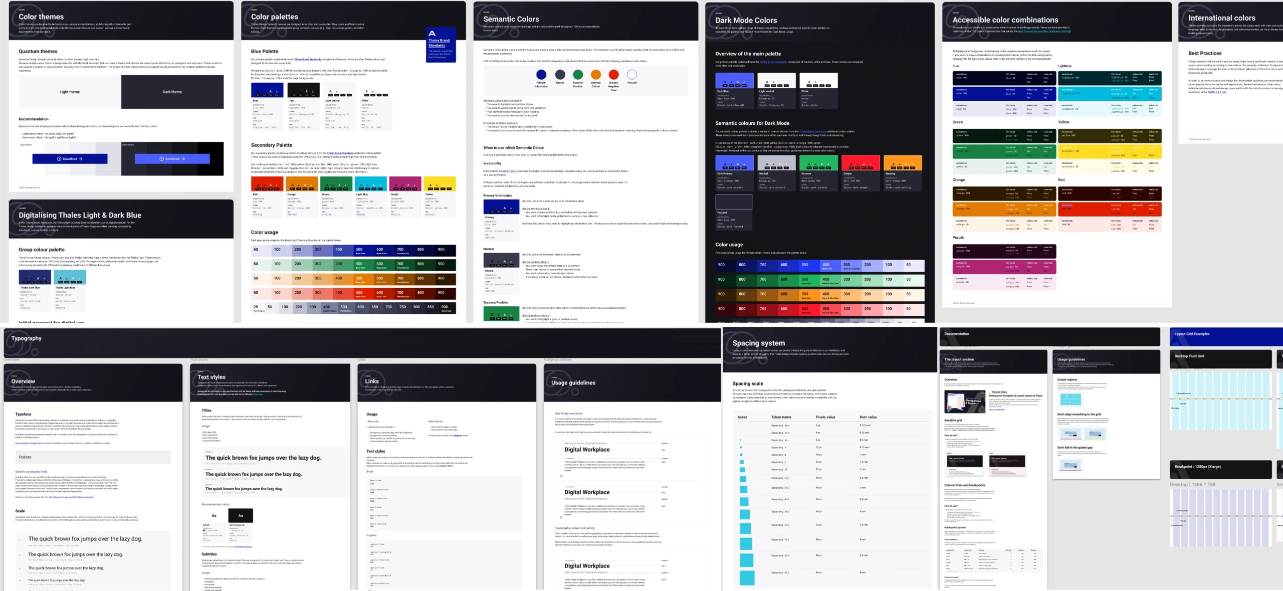
Defining the Foundations
The first step in building the design system was defining its foundations.
Foundations serve as the building blocks for every component and interface. I started by establishing core elements such as color, typography, spacing, elevation, and layout structure. These were defined using design tokens, ensuring both design and engineering referenced a shared source of truth. This helped maintain consistency and made the system easier to scale and update over time.
To ensure the system was structured and scalable, I followed the principles of Atomic Design. I began with foundational elements like colors, typography, and spacing (atoms), then used them to build reusable components such as buttons, inputs, and form elements (molecules). These components were further combined into more complex patterns like forms, modals, and navigation structures (organisms).
This approach helped create a clear hierarchy and ensured every component was built on consistent foundations, making the system easier to scale, maintain, and adopt across the product.
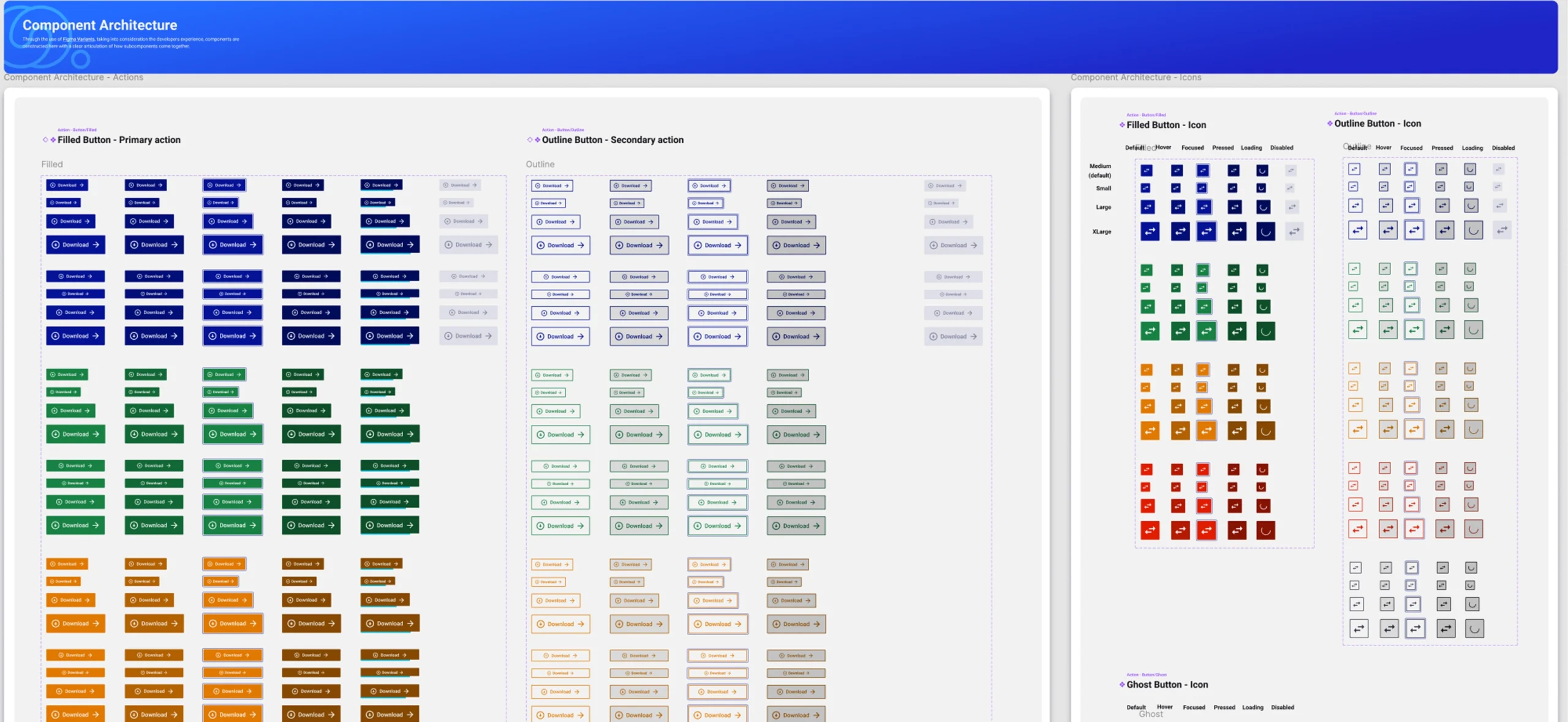
Designing Components as Scalable Building Blocks
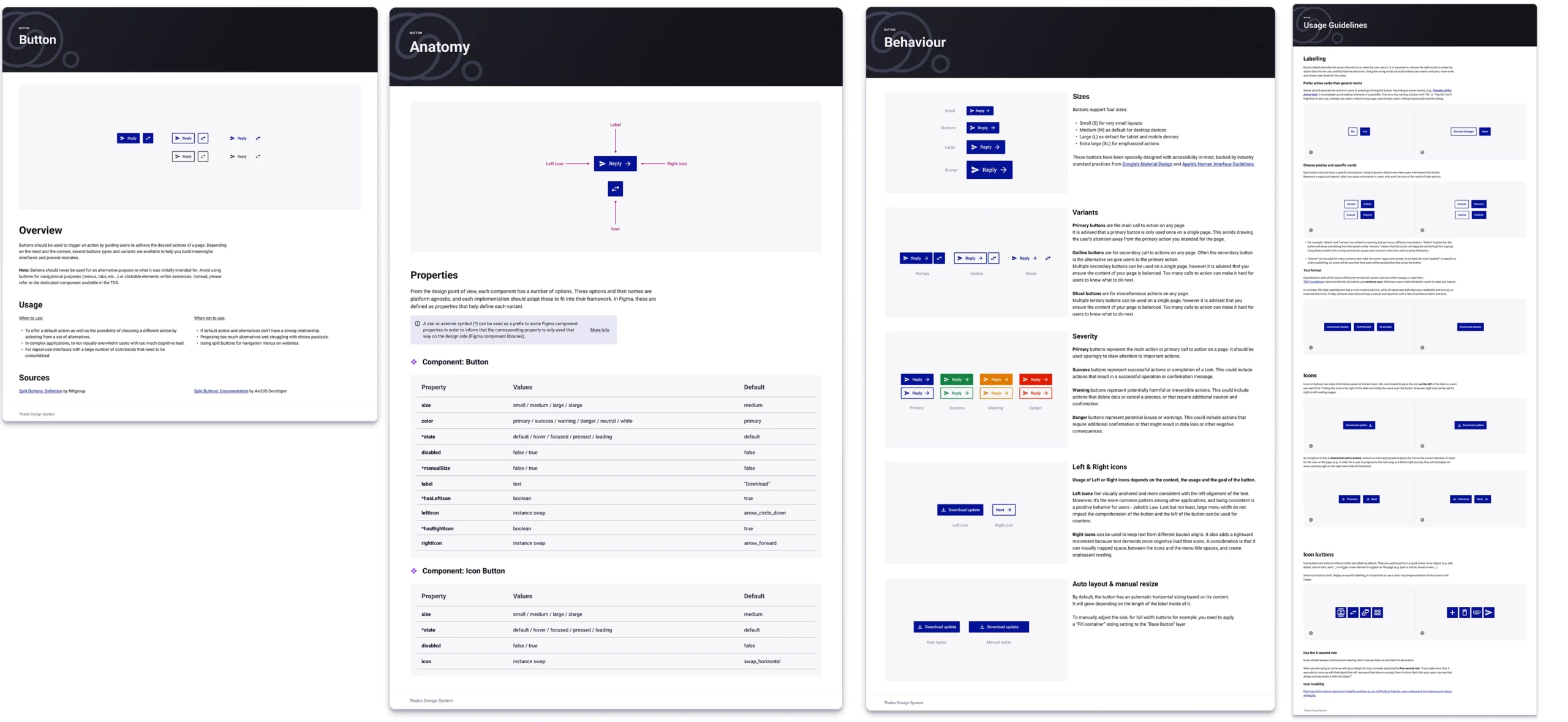
Once the foundations were established, I began designing reusable components such as buttons, inputs, dropdowns, checkboxes, modals, and navigation elements. Each component was designed as a flexible and scalable building block rather than a fixed element.
I defined:
Multiple sizes
Interaction states
Variants
Accessibility behavior
Usage guidelines
This ensured components could adapt to different contexts while maintaining consistency. Each component was designed with usability, accessibility, and scalability in mind. Instead of creating multiple custom versions, teams could now reuse the same component confidently.
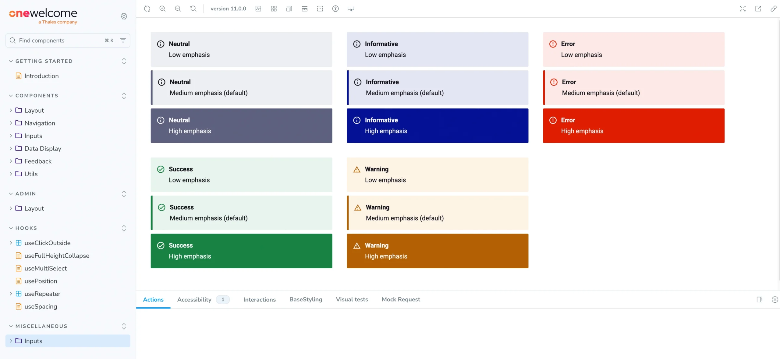
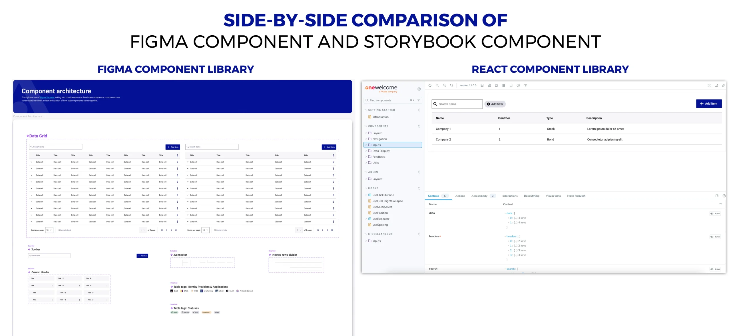
Structuring the Figma Component Library
To support adoption and usability, I created a centralized Figma component library to serve as the single source of truth for designers. Components were structured logically, with clear naming conventions and scalable organization. This allowed designers to quickly assemble interfaces using reusable components instead of recreating elements from scratch.
This significantly improved efficiency and consistency across design work.
Check out the Figma Component library
Collaborating with Engineering and Storybook Integration
A critical part of the design system was ensuring that design and development stayed aligned. So close collaboration with engineering was essential throughout the process.
Storybook served as the implementation reference, where each component was documented, tested, and used by engineers. The OneWelcome React component library, implemented and documented using Storybook, became the development counterpart of the design system. This created a shared environment where both designers and engineers could review components, validate behavior, and ensure consistency. It also improved handoff clarity and reduced ambiguity.
Storybook link:
https://onewelcome.github.io/react-lib-components/
Stakeholder Collaboration and Reviews
Throughout the process, I regularly collaborated with product managers, engineers, and other designers. We reviewed components together, validated requirements, and ensured the system supported actual use cases. This collaborative approach ensured that the system was practical, usable, and aligned with business and product needs. It also created shared ownership, which is critical for adoption.
Accessibility and Usability Considerations
Accessibility was a core consideration throughout the design process. Components were designed with proper contrast, interaction states, and usability in mind. This ensured the system supported accessible and inclusive experiences.
Consistency itself improves usability. When users encounter familiar patterns, they can navigate and interact with the system more efficiently. This was especially important in enterprise environments where users rely on speed and reliability.
Figma example for Accessibility annotations while handling off design to developers.
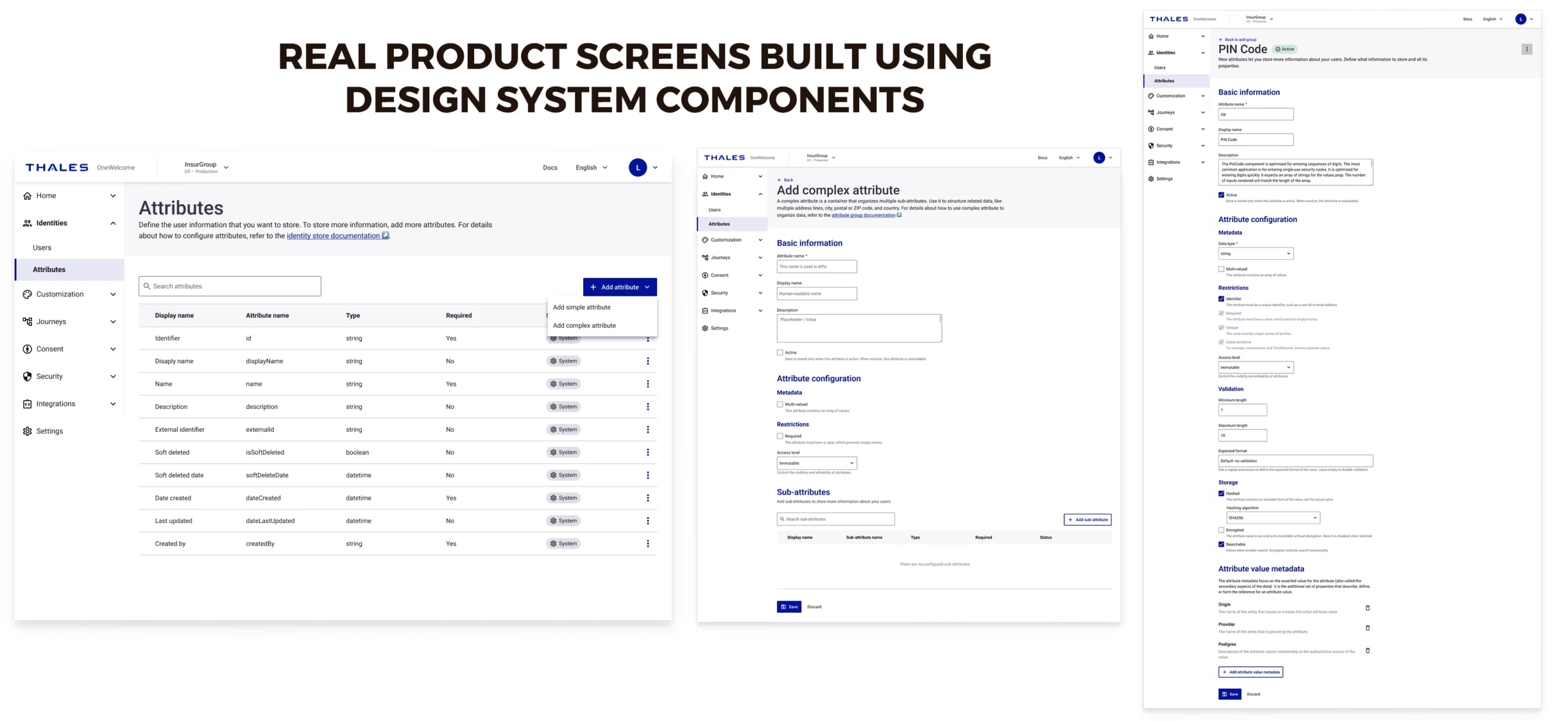
Adoption and Impact
As the design system was introduced, teams began adopting reusable components across the product. This improved both design and engineering efficiency. Designers could build interfaces faster using predefined components. Engineers could implement features more efficiently using the shared component library. It also strengthened collaboration between design and engineering by establishing a shared foundation. The product experience became more consistent, scalable, and maintainable. Most importantly, the system created a foundation that could support the platform’s future growth.
What I Learned
• Designing the OneWelcome Design System fundamentally changed how we approached product design.
• Instead of designing isolated screens, we began designing systems.
• Designing a design system taught me that consistency isn’t just a visual improvement, it’s a scalability strategy.
• It requires systems thinking, cross-functional collaboration, and a deep understanding of both user needs and technical constraints.
• A successful design system isn’t just a library of components. It’s a shared foundation that enables teams to build better products, faster.
• The design system continues to serve as the foundation for building reliable, scalable, and user-centered experiences.
Final Outcome
The OneWelcome Design System transformed the way we design and build products. It created alignment between design and engineering, improved consistency across the platform, and enabled scalable product growth. Instead of designing isolated screens, we now design and build from a shared system. And that shift fundamentally changed how the product evolves.
Links
Figma Component Library : https://l1nq.com/vTft6
OneWelcome React Library (Storybook) : https://onewelcome.github.io/react-lib-components